Established UX program for Library IT
& built our current team; develop and mentor our student designer, researcher, and editor
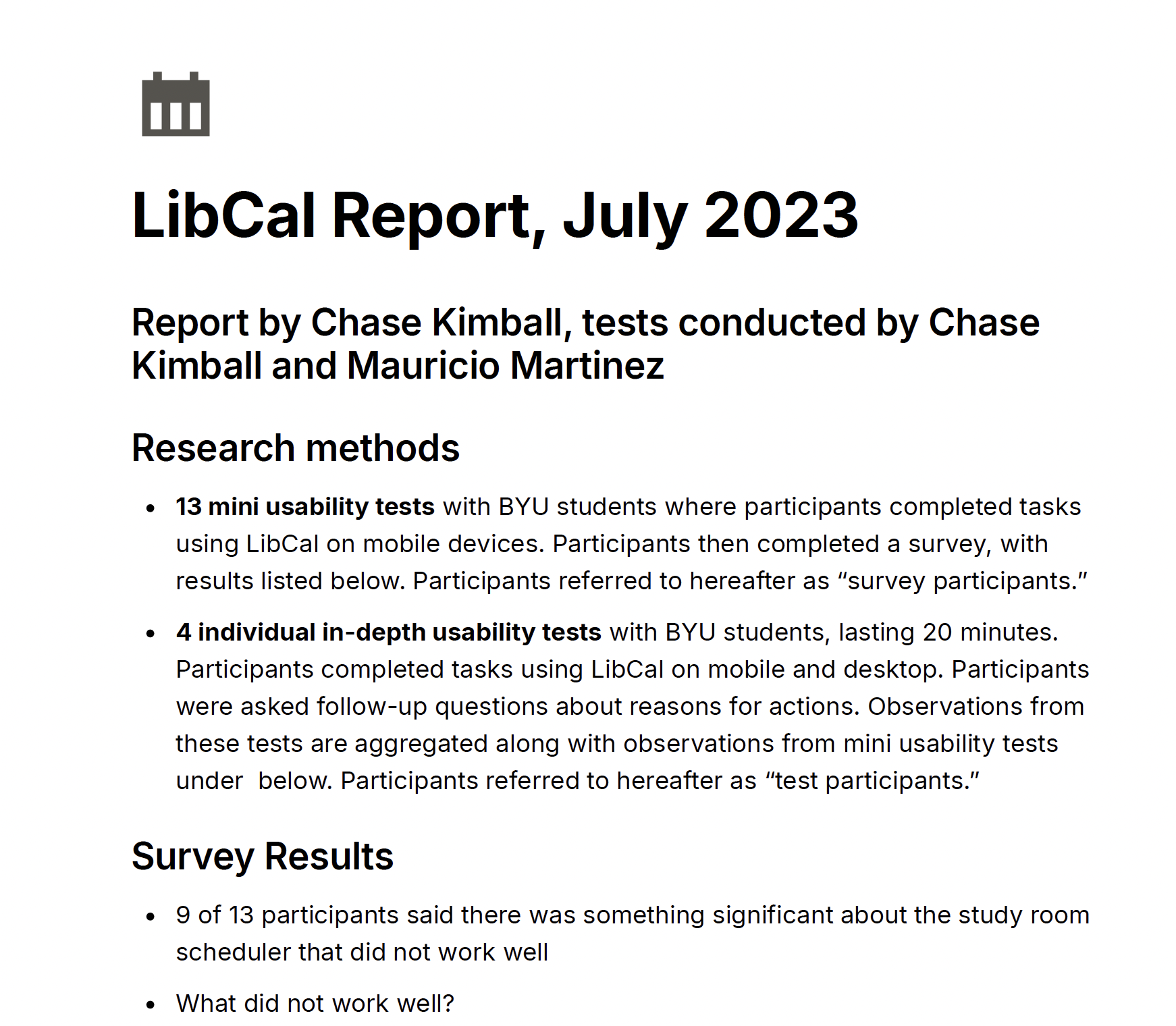
One my first big UX research wins for the BYU Library was a project to replace a bespoke software that scheduled different rooms in the library. This is our second most-used product by our students. The choice for our product team was either rebuild it from scratch – to update the tech stack, or go with something out of the box, though not as detailed or custom. The ROI was a big deal with this, because we would either a third-party software we already had but weren’t using the calendar feature (a small yearly subscription fee vs. months of expensive software engineer hours. We needed to show our students would be happy enough with something that did 90% of our bespoke solution, especially to win over faculty who were so far expressing some dissatisfaction with the rollback in features.
We started with open-ended interviews to understand how students used the scheduler. From there, we launched a broad, quantitative survey to a random sample of our 30,000+ student body. Of 1000 invitations we received 250 responses, which was a higher than average response rate. Our data showed students’ most-wanted features were readily available in the third party app. We knew we could be confident that going with our out of the box calendar app would work, and the only engineer cost would be implementation. We later found that the addition of the calendar feature cost us no more than our existing subscription for other apps, which made the savings for the library even bigger. By the time we implemented the software, I had another research student on the team, and he also did excellent work confirming student satisfaction during and after rollout so we could make sure we used all the customizations we could in the out-of-the-box scheduler to make it as user friendly as possible.
The savings isn’t really the whole story, though, because while that was our business purpose, what amazed me was how capable my students were and how much they grew in this time. My researcher worked hard to clarify and tighten the survey questions. She expanded her repertoire of research methods and question writing. My student designer was able to ideate as we spitballed initial possibilities for a new bespoke app, but once we learned the most cost-effective would be a purchased solution, he learned that sometimes, you have to set aside some really good work. The best thing I get to do in my job is mentor young professionals, help them level up their classroom skills in a real agile environment, and see them get excellent job offers after graduation.

Redesigned information architecture of main library website
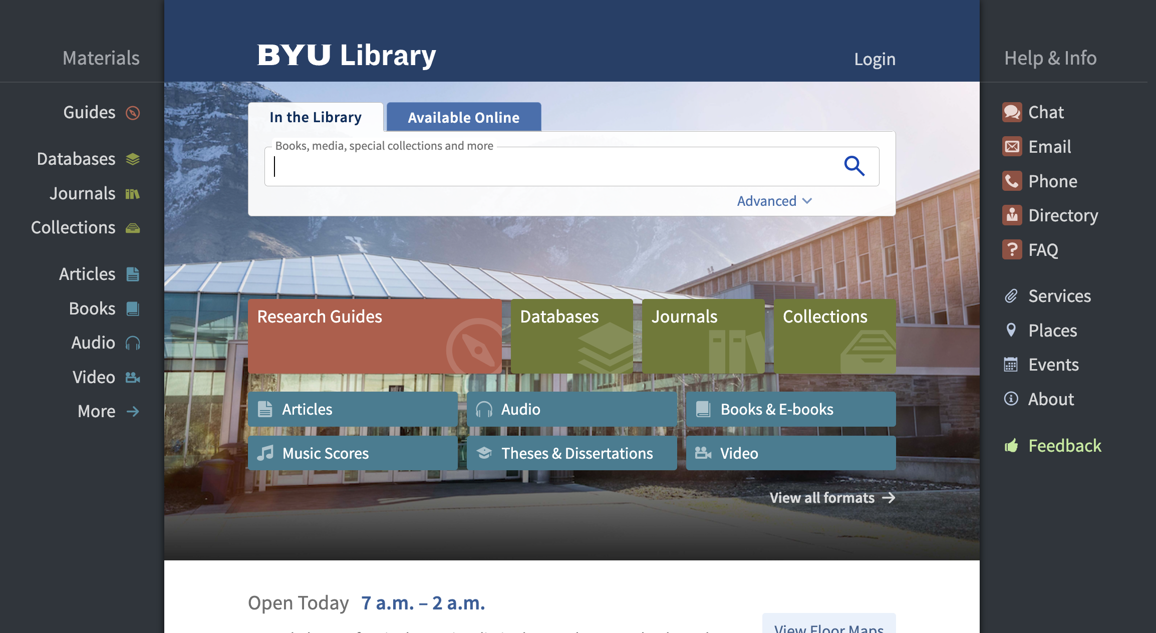
Another large-scale project that is making a big impact on our whole design ecosystem —microcopy, UI, design system, training—is the information architecture of the main site. Universities are traditional by nature, and university libraries are even more traditional. There’s very much a sense that the librarians are almost sacred curators of knowledge. And while I love learning, reading, and I loved studying at college, this attitude sometimes became an impediment both to convincing my colleagues to adopt UX practices and treat users as experts of their own experience, and the tendency to define the website and its object based on the organization.
To help get away from this while both teaching librarians and other colleagues, and earning their buy-in, I led an OOUX session to redefine the website architecture. Previously, a user would have to know how the library named and grouped its departments in order to find what they need. As I explained to my colleagues, it’s like your bank requiring you to know how their divisions are organized in their business in order to access your account. It’s absurd.
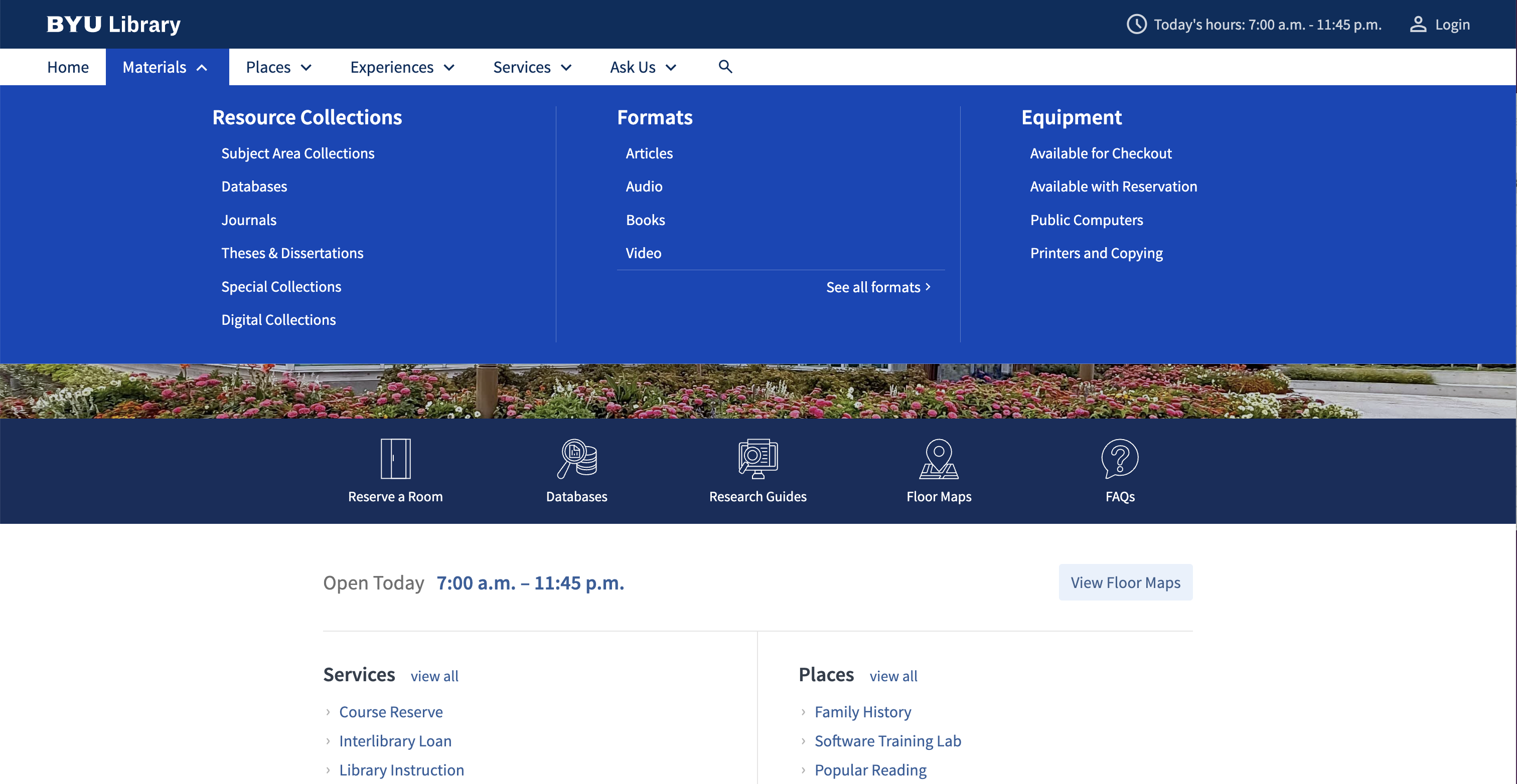
So we began our OOUX session with stacks of sticky notes, and worked through everything that existed on our site. The most difficult part, in any organization, is agreeing on what things will be called. And it took us a lot of time to do this. What helped was the research our team had prepared, showing what jargon users didn’t understand. We pushed a little on this, because librarians have a certain way their profession does things, so they feel this is almost non-negotiable. But as we worked more, we explained that our users don’t have a masters degree in library science; it’s not about invalidating the expertise of librarians, but delivering it to users in a way they can grasp. We came up with relational information architecture principles that we have since been able to use to move forward with new navigation. Since its an iterative process, our links are in a sort of half-baked stage, and as we get more analytics, we can confirm our learnings with users and continually update them to best serve their needs.
NAVIGATION BEFORE & AFTER
Wayfinding redesign for university library
research, experimentation, iterations, roadblocks, report (as chair of signage task force)
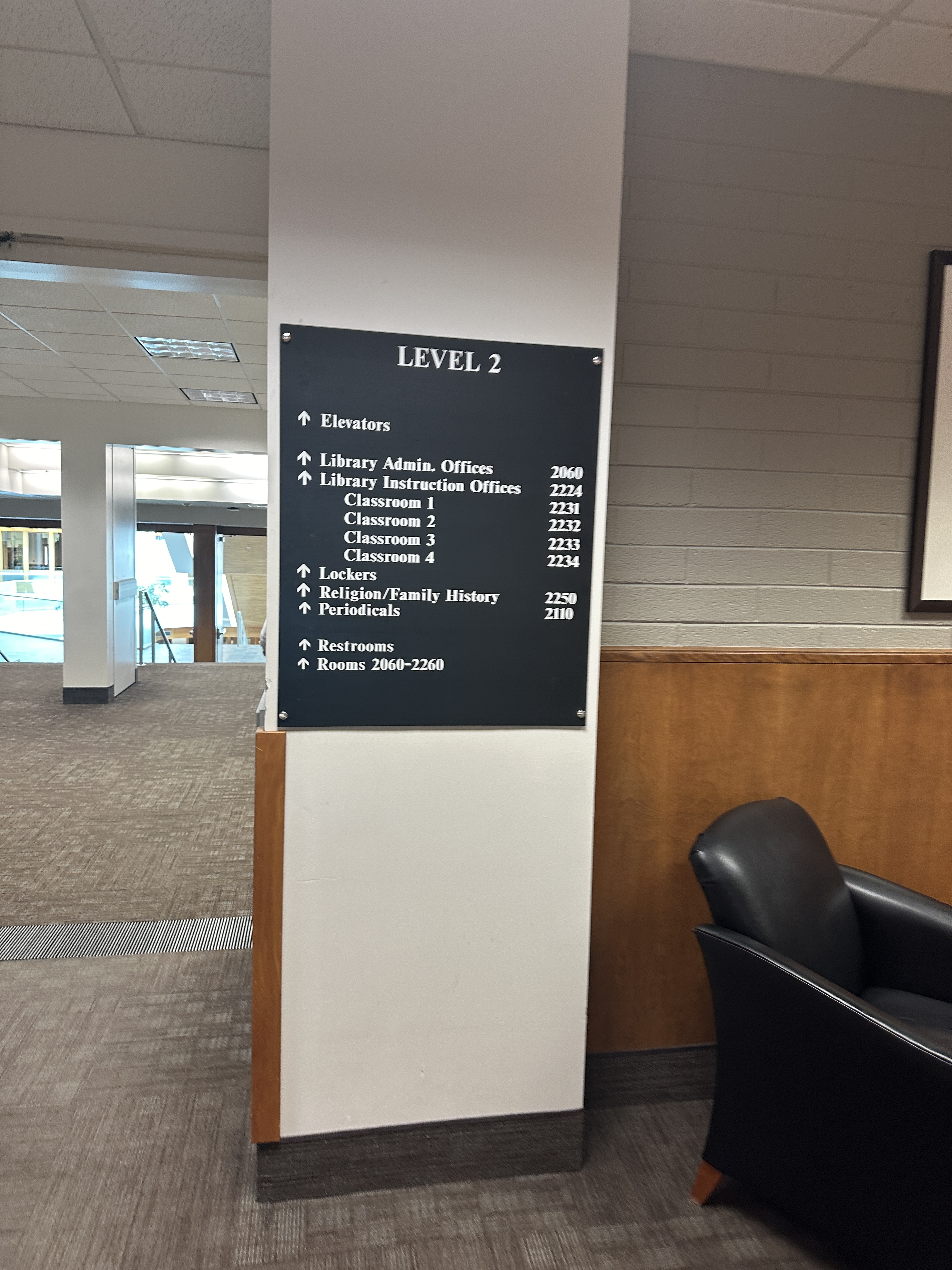
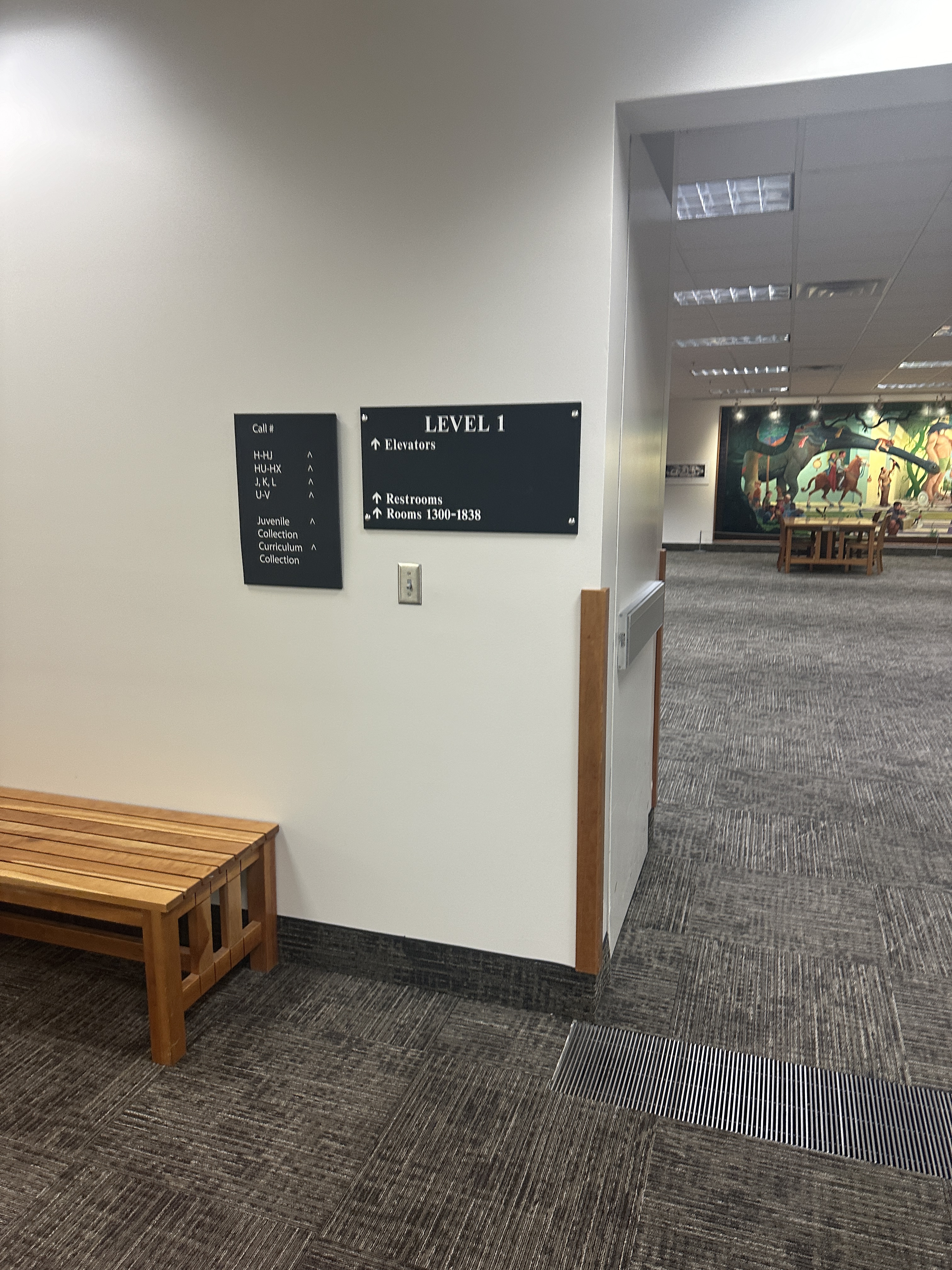
Signage in libraries is widely inadequate. This is what I learned as I chaired a task force to find out how to make our signage better serve our users. I could tell just from seeing our old signage that our own was inadequate and some cases, it was completely useless because it was either not visible or outdated. Pretty egregious!
We commissioned research from our assessment department on decision points in the library to hone in on where the best signage placement might be. We could test further once test signs were made.
Next, we started looking at all of our old signage (right) as a group. We divided them into 2 main categories we would be measuring and trying to improve: directional (getting there and arriving) and informational (instructions on how to use printers, for example). We divided a rather large task force into 2 groups and subdivided the categories for more customized analytical methods. We found that the language on the signs was not the problem, but the design was.
One of the task force members was the steward of signage and noted that signs hadn’t been ordered in 10 years or so. He was in the camp of “let’s order signage again and then wait another 10 years.” And he was the only one in that camp, which made disagreements rather difficult. All the rest of the task force felt our charge was to improve what we had with an incremental approach, then test to see where we can make small positive changes. We carried on and tested some cheap, basic signs with users and gathered feedback.
Among internal users of the system itself (library colleagues) there was a lot of dissatisfaction around getting signs approved. The signage steward would frequently remove signs that were in violation or unapproved, but would neither create signs, nor give feedback on how to make them acceptable. And as colleagues needed this method to communicate with patrons, it became a point of major frustrations.
In response, my vision for the task force—and the direction I led the group in—was to create a design system for signage, including templates, that would make my colleague’s work easier, since he isn’t a designer but a PR professional. Essentially, colleagues would have an easy to use kit in Word or Canva where they could make a sign; we would have a library of approved signs so they could see examples of acceptable usage; colleagues could create signs that complied and submit them for approval. This would save the signage steward time, and a style guide would help him give useful feedback. I planned to make templates for the PR office’s student designers (who were usually illustration, not design students) to make sure they stayed on-brand. The main idea is that the sign system would be a living system that would allow changes as frequent as we needed them. With constant library construction for the foreseeable future, this was an essential point of the plan I laid out.
Iteration 1
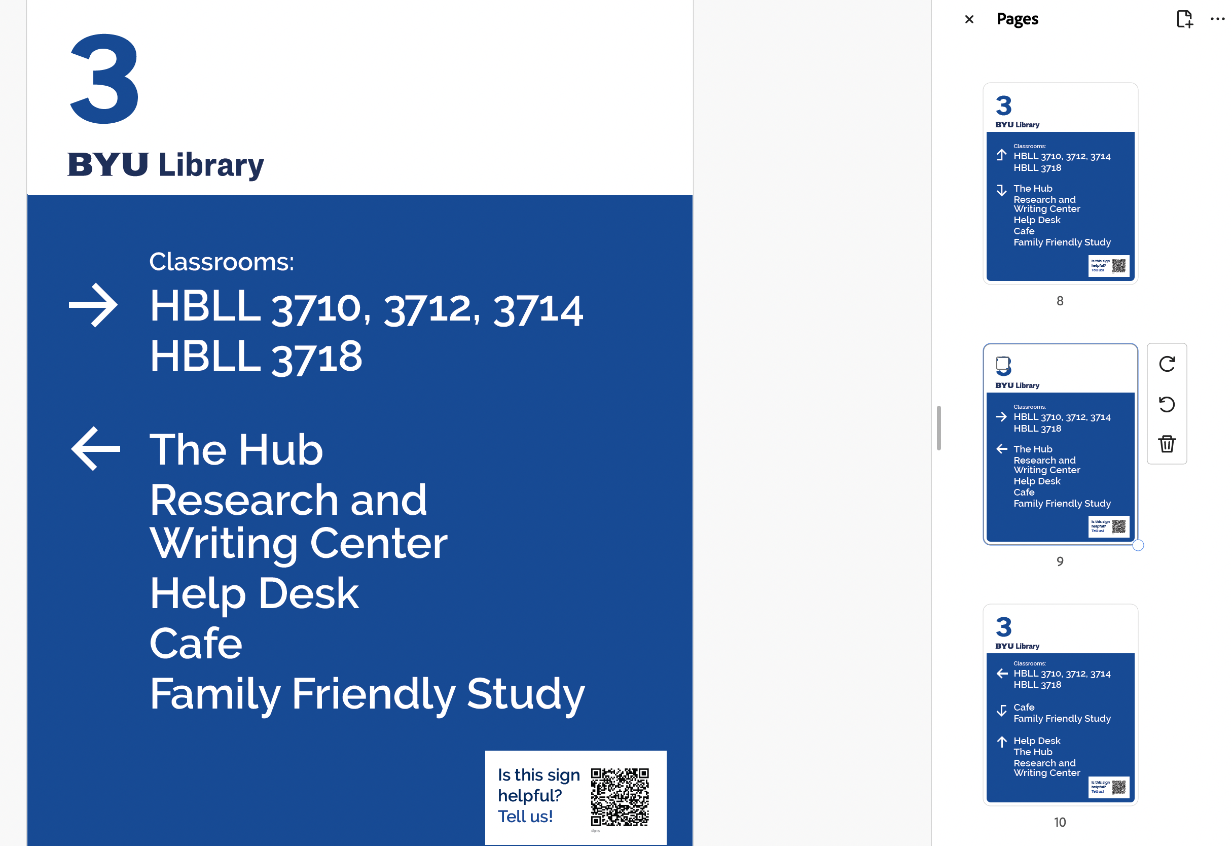
Our first signs were the most basic blue and white derived from the overall campus brand.
Feedback:
- the arrows didn’t work well or were confusing
- colors are boring and hard to notice
- each floor should have a color
- there are too many signs
- placement seems off for some signs
I studied the use of arrows in signage, and especially applied the following for our next iteration:
- arrows should point to where you are going, while items behind you fall off the sign
- only right, left, and “up” arrows (indicating straight ahead) should be used
- avoid using up arrows near stairs or escalators, as it could make users think you mean up or down, not ahead
- point arrows away from, not into, type
Iteration 2
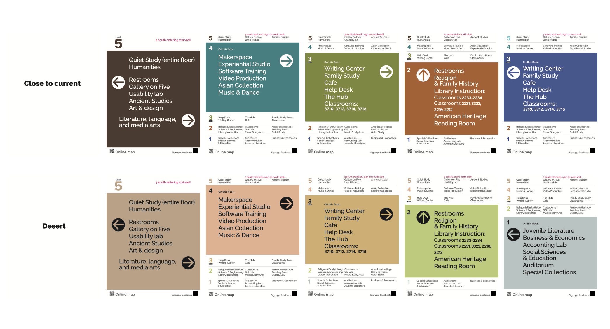
We tested palettes in 2 phases. We started with 4 color options, and narrowed it to these two (left).
Students preferred the top row of more saturated colors, so we applied these to the signage we had made.
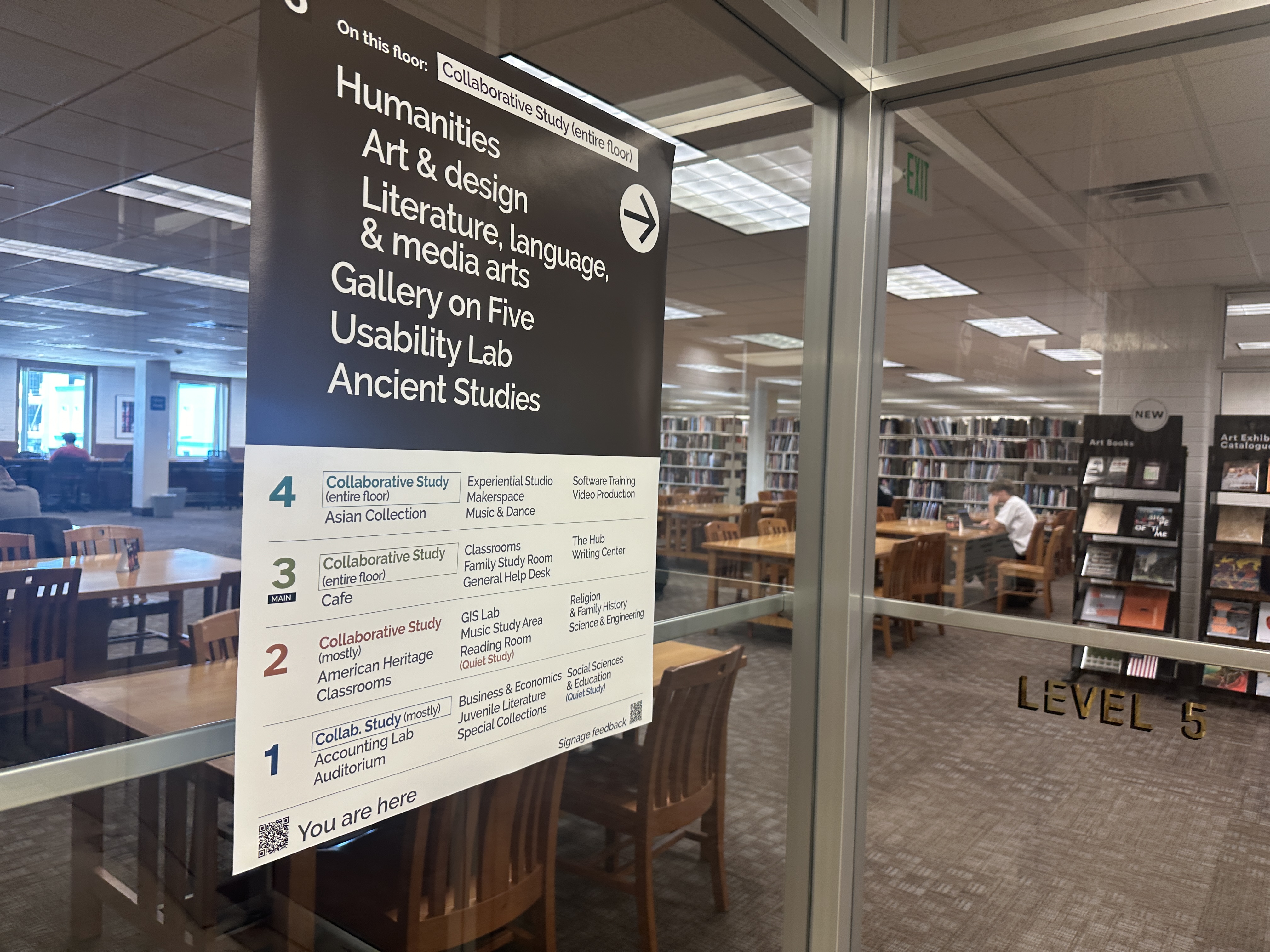
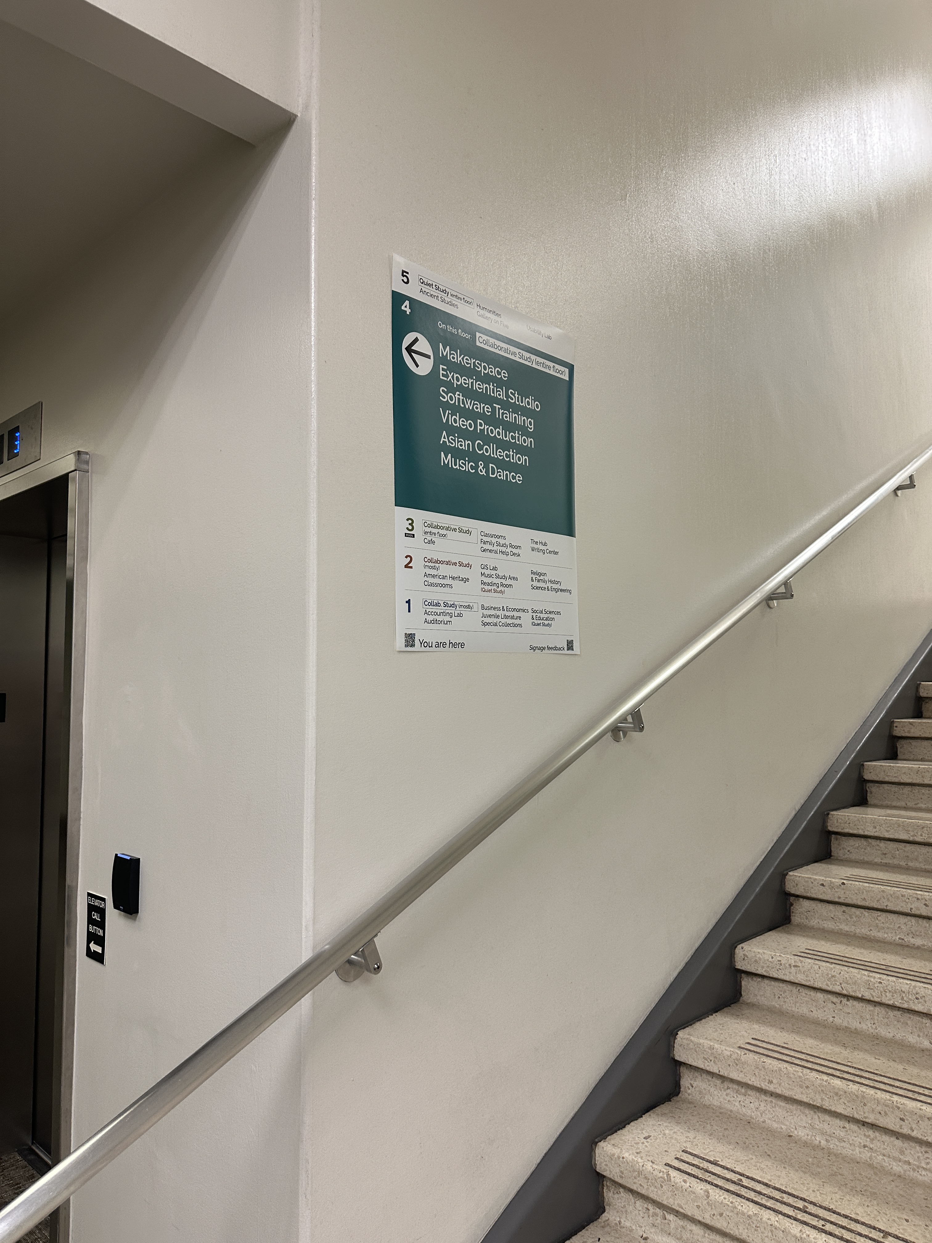
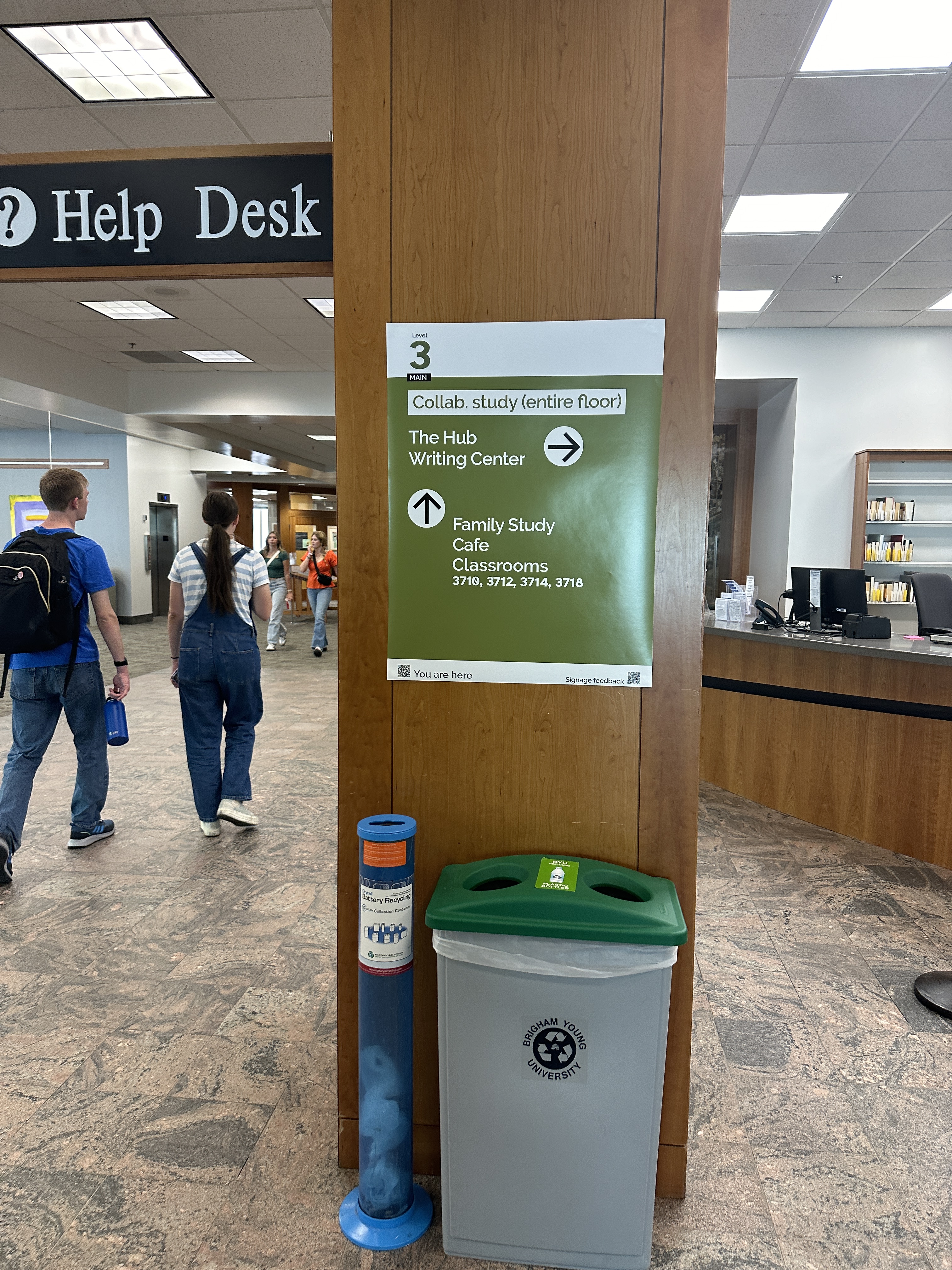
Iteration 3
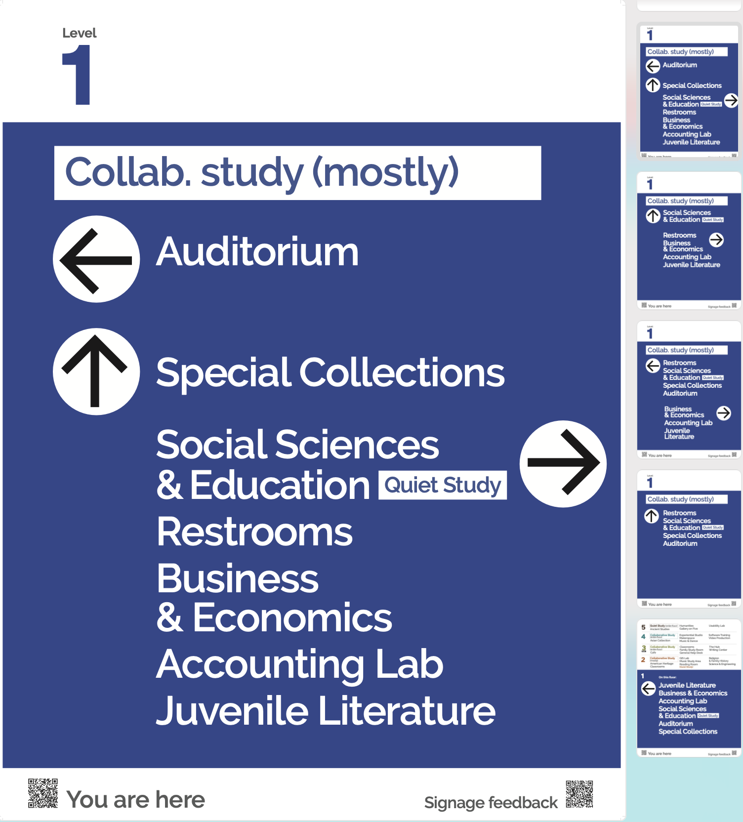
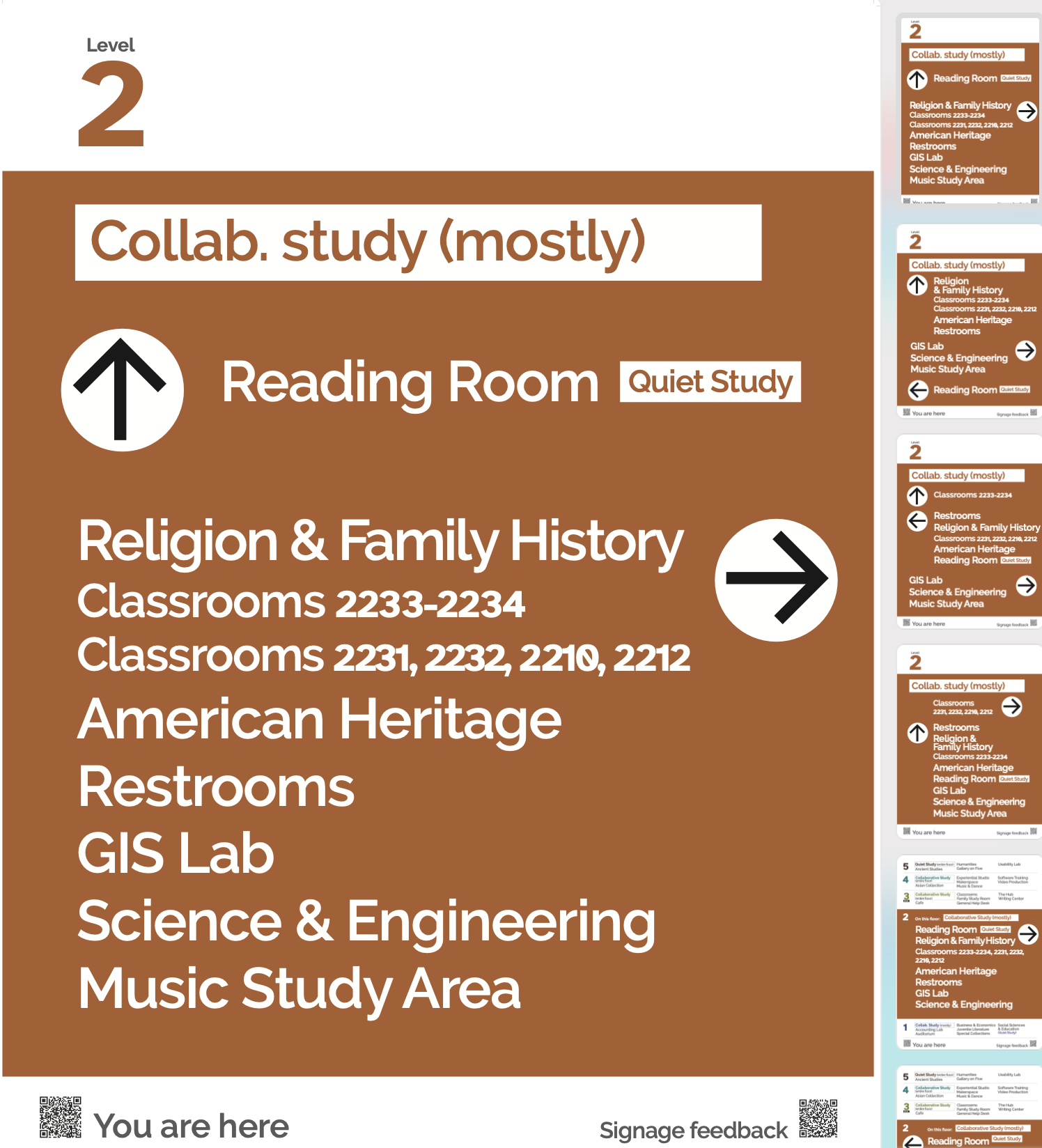

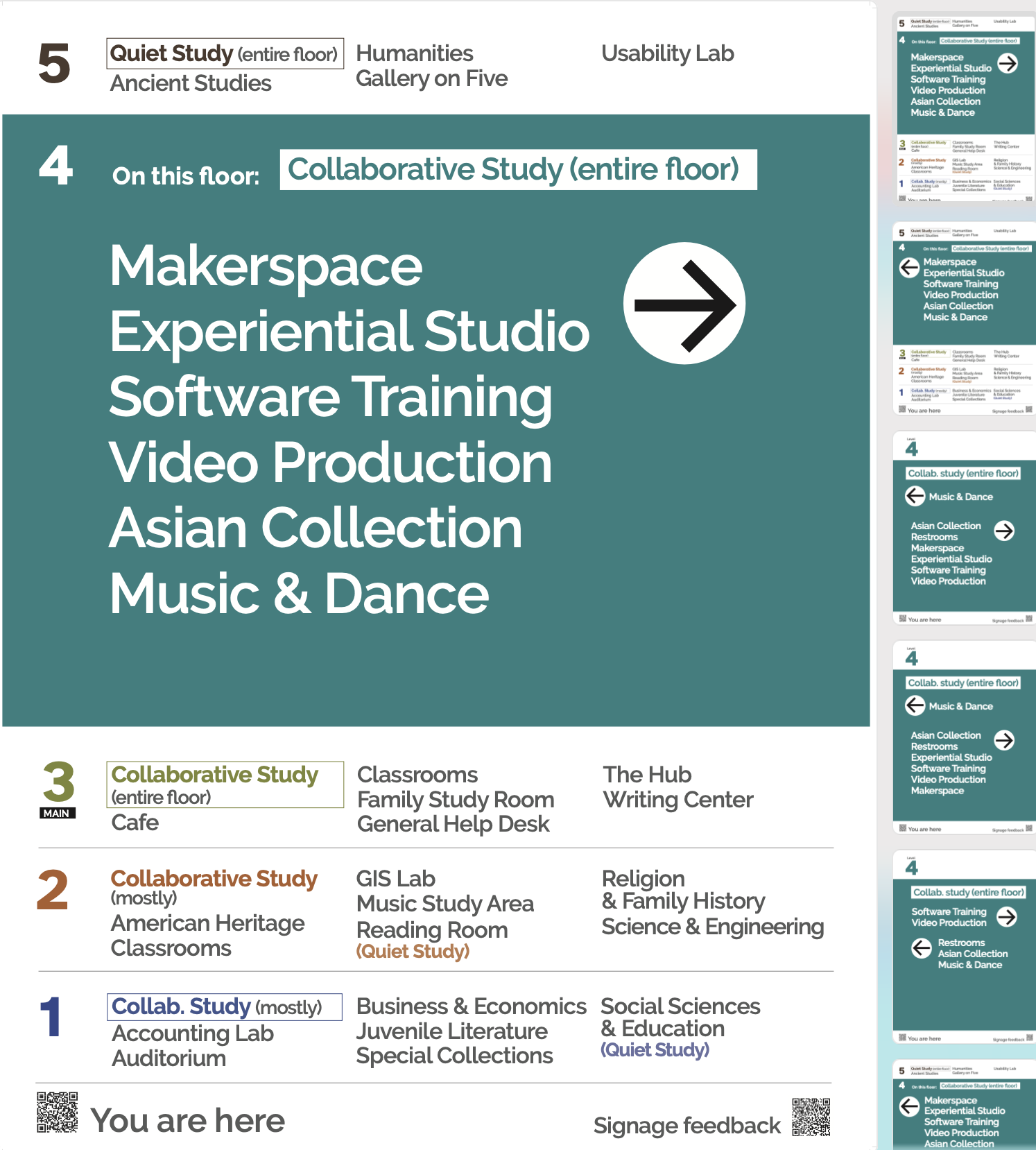
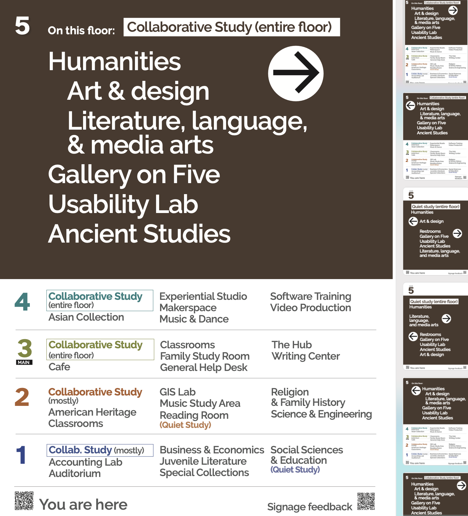
For this iteration, we combined the more popular palette with the improvements to arrows and organization from the previous tests.
We were able to test overall readability and usefulness of the signs and their placement. With this data, we finalized more or less the “final” iteration of our task force, though this would only be the beginning, and would be created to adapt to the needs of external and internal users (patrons and colleagues). We included “you are here” codes at each location with links to our online maps app.
Our final test was organized by a group of behavioral psychology students, who created tasks for users to find places on the map and measured times before and after the new signs were installed. They discovered that users found their destinations faster with the new signs. They also surveyed students about their satisfaction with the signs. The research showed the signs were helpful, and students found them satisfactory.
After the task force ended, library leadership decided to keep the signs up. The task force ended before we could finish creating and documenting a design system, but I count the project a success, especially considering we did this with a very low budget. Compared to the $100,000 or so that a third party signage redesign costs, we created signage for maybe $200. This gives leadership the choice to either keep and make permanent the system we created that allows inexpensive and immediate updates so the library can be responsive to patron needs, or to use the data to start farther along in user centeredness with an external vendor.
Latest iteration